Travel Digital Scrapbook Layout
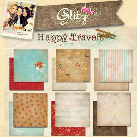
Hello fellow crafters! Candice Meyer from the design team here with a fun travel themed layout. Summer is all about adventures, right? Whether it’s simply running through the sprinklers in your backyard or discovering architectural gems in European cities, you can document your memories using gorgeous papers and embellishments found on the Snap Click Supply Company site. My husband and I enjoyed a few days in Canada last month touring both Ottawa and Montreal. We had a blast! The Happy Travels collection was perfect for capturing details and photos of our getaway.

I highly recommend Jessica Sprague’s digital scrapbooking classes to help you learn the ins and outs of Photoshop—with her easy to follow instructions and awesome design tips, you will be creating gorgeous digital layouts in no time! Here’s one secret: LAYER! And then, LAYER some more!
Here’s a snapshot of my process:
- Select your base paper and photos. Tip: Use your photos as design inspiration- what colors, backgrounds, and patterns will coordinate with your subject? I chose photos that complemented the red/blue color combination of the Happy Travels collection.

- Use clipping masks to create multiple layers of papers and embellishments. This process also helps you to create “texture” in a digital format as various elements overlap! I grouped together 2 circles, 1 ribbon banner, 1 polaroid square, and 2 square shapes into a cohesive unit. Tip: Don’t be afraid to mix things up and use designs from multiple collections. As you can see in the supply list, I utilized key graphics from several different kits that coordinated with my travel theme.

I love how this focal point turned out!
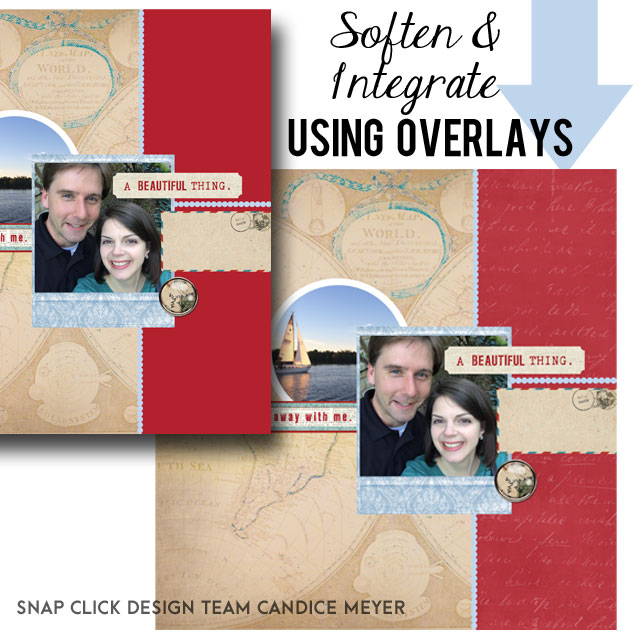
- Experiment with creating drop shadows and changing the opacity of various layers. For example: I created a red band along the right side of my layout using the rectangle shape tool. Having this color block right next to the patterned paper was just too stark of a contrast. I added 2 layers to help soften and integrate this pop of color into my composition. First, I clipped a simple overlay from the PDQ collection to the red rectangle and set the opacity to 12%. Then, I clipped a writing overlay to the top for added interest. I set the opacity of this layer to 23%. Even barely visible additions can make a dramatic difference in your compositions!
The best part of this project? Not only is it beautiful, but it came together quickly and easily! …which leaves time for more summertime adventures! Double win! Cheers to capturing and documenting your unique story!
Supplies:
Happy Travels Papers
Happy Travels Embellishments
Fact & Fiction Element Pack 2: Button
Fact & Fiction Element Pack 3: Letter
Polaroid Frames
PDQ Overlays Vol. 11
Grunge Factory 2: Lettering Overlay
Jenni Bowlin Classic Border Shapes